Mainstream
Why Art Direction Matters for Gaming
With the 8th console generation’s leap in power, we have already seen some impressive displays of graphical fidelity. InFamous: Second Son immediately comes to mind and the in-game photo mode only proves how incredible it can look. But years down the line, it isn’t a stretch that we’ll be thinking that it was a good try but hardly anything special to whatever big-name game rolls around in 2018. A game’s art direction can make it timeless in a sense. It can be the difference between a great game and an iconic one. There are a lot of compelling reasons to really pursue an engaging art direction, if not an innovative one. For me, a game’s art direction speaks volumes about its intent. Will it be a fantastic journey rife with inventive design and breathtaking scenery? Or will it be something else in pursuit of stunning photo-realism? There’s room for both of these, of course, but without a decent art direction they won’t reach their full potential.

For example, look at The Wind Waker. Sure, it did eventually receive a new high-definition coat of paint, but the original still looks totally serviceable and probably will for some time to come. Skyward Sword still looks fine as well but, in my eyes, probably won’t hold up as well as The Wind Waker. Meanwhile, Twilight Princess started showing its age very quickly as, although ambitious, very drab and muddy for the most part. The latter had symptoms endemic to a lot of the last generation’s releases and while it seems less stylistically prevalent now, I still think it’s problematic and representative of the issues gaming has with its popularized representation.
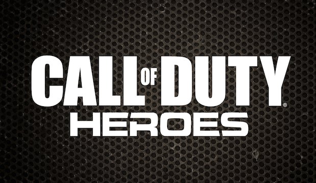
It’s no mystery that Call of Duty is an immensely popular franchise. Coincidentally, it also neatly encapsulates everything wrong with video game art direction due to its notoriously subdued and neutral color palette. This adherence to realism isn’t necessarily a bad thing, but it sort of demonstrates a lack of confidence in video games as a medium. The quickest method of assessing anything is to do so visually so this subdued, ‘gritty’ color scheme subtly suggests that Call of Duty is, in fact, a mature, serious game well-deserving of your attention as a consumer. Its palette attempts to invoke a sense of gravitas but to do this so persistently is evocative of trying too hard.

I know that the debate of games being art is both long-held and frankly sort of absurd but every time I see it nobody ever seems to suggest that there is both good and bad art, as if they have to be mutually exclusive when they clearly do not. Accepting all art as good is inherently controversial because it fails to accurately acknowledge an artist’s efforts, while rejecting all art as bad is just petulantly ludicrous. Why are video games exempt from that line of reasoning then? Some video games, like Journey, can be both artistic and a unique, entertaining experience.
To be clear, a bad art direction certainly does not mean that the game itself is bad. Whether or not Call of Duty aims to get your intention by suggesting it is serious and deserving of respect is ultimately irrelevant because it sells and it does that very well. What matters most is if the game is fun and if it accomplishes that then there really isn’t anything to be too upset about.
The reason that I challenge Call of Duty in particular for this though is that it, admittedly like many video games, is very derivative and even worse it’s derivative of itself. But above all it commits one of the gravest sins I think a video game is capable of—it generally takes itself too seriously. Watch Dogs is similar in this respect because it clearly wants to be perceived as a serious and dramatic tale but when I can use a smartphone to blow up a steam pipe and send the police chasing after me flying through the air, as well as considerable damage to everyone who was unfortunate enough to be nearby, it’s kind of silly.
But that’s a good thing. Watch Dogs is at its best when it fully embraces its crazy premise and revels in all of the insane opportunities it brings and far removed from its profoundly dull narrative. Are there exceptions to this? Absolutely. Ignition Tokyo’s El Shaddai: Ascension of the Metatron was an absolutely creative and gorgeous endeavor but as a game it was about as inoffensively bland as it gets. Even then, if you want a more popular example, the art direction of the Uncharted series typically employs a very wide and beautiful palette.

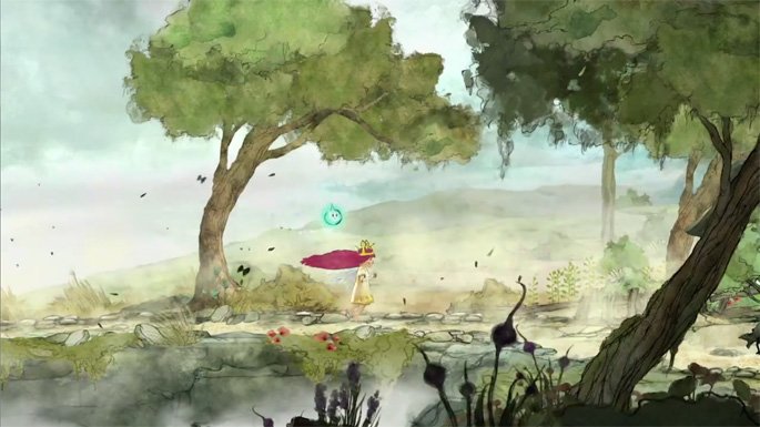
You obviously can’t get by on looks or charm alone. There has to be some substance there worth delving into. Child of Light, Ubisoft Montreal’s recent crack at a westernized JRPG, is best described as a painting that you can explore and it is marvelously detailed and a joy to behold… but there just isn’t much there beyond that, no matter how solid the gameplay is, due to its brevity. A quality art direction and in-depth gameplay are certainly ideas that have been married before and ideally should always be. Indie games have the liberty to explore this but it shouldn’t be limited to them alone. AAA gaming has done it before and should keep pushing the envelope.
I’ve noticed that starkly realistic games always paint the world as aggressively bleak or corrupt. Yes, it might be easy to communicate that things are bad with a dreary, dark, and muted color palette, but it’s also safe and at worst it’s lazy. A world of color does not a happy world make. Could I be extrapolating too much from how a game looks? Possibly. But I think that art can be awe-inspiringly powerful and influential. Video games are a media with vastly untapped potential that combines so many other art forms that could culminate into something groundbreaking. It might just take a creative risk here and there.


Usenet newsgroups may seem old-fashioned to many. In reality, they are the perfect place for players who love the classics but are always open to new games and strategies. These internet communities are also ideal for those searching for gaming material, solutions to issues, or a conversation related to their favorite video games. Whether you are an experienced player or entering this domain for the first time, Usenet holds a ton of resources that could change how you interact with the gaming world.
Understanding Usenet Newsgroups
Usenet newsgroups, which include gaming groups, are like message boards. People can post messages and articles in different categories. Each group is a special place for certain topics – this makes it simple to find the subjects you want to read about most. The unique characteristic of Usenet lies in its decentralized structure. This permits a much more open interchange of details and information than what is seen on regular social media platforms or forums.
Initially, Usenet was utilized only for academic and professional exchanges. However, it soon turned into a prevalent method for communicating among hobbyists and gaming groups. Presently, even though Usenet has been surpassed by newer platforms in terms of popularity, it continues to be an important tool for knowledgeable users who value its special mix of staying anonymous with fast communication. Knowledgeable users also love access to vast archives containing historical information and software applications that are no longer available elsewhere on the Internet.
Top Usenet Newsgroups for Mobile Games
comp.mobile.games
This is a fresh group dedicated to discussions about mobile games and related technology matters within the industry. Here, you can find conversations about the coding aspects of creating games for mobile devices, like new updates in platforms or fresh game engines being used for development purposes.
rec.games.mobile
The perfect place for people who play games on their mobile devices as a hobby. Here, users talk about strategies, tricks and discuss game evaluations. This group is also suitable for those who are not serious gamers but like to connect with others and discuss playing strategies.
alt.games.mobile
In this newsgroup, users often discuss gaming fixes and give each other suggestions. It is also the go-to place for gamers and die-hard fans that wish to find each and every detail of the game they love to play.
Best Newsgroups for Video Game Discussions
Newsgroups such as alt.games.video and rec.games.video.arcade have lively communities where gamers often engage in exchanges and conversations. These forums are not only for resolving gaming issues or writing reviews; they are centers of enthusiastic discussion regarding gaming culture, strategy, and creation process. Be it the latest RPGs, energetic shooters or old-school arcade games – there is always a thread bustling with discussion.
In these threads, not only will you encounter a variety of views from across the globe, but you may also land on gaming tricks and shortcuts that are lesser known. For those who are new, remember that every group has its own tone and rules. Lurking for a while should help you understand community norms and ensure your contributions are accepted.
Specialized Gaming Newsgroups
Specialized newsgroups are designed for particular gaming communities. They provide a discussion environment that is more centered and focused. These groups are ideal for users who really love a particular game and want to explore it in great depth.
The benefit of these specific groups is their collection of very particular details. Gamers who are part of such a group often exchange unique things like custom mods or skins, and offer advice on how to make gameplay more efficient and fun.
Tips for Using Usenet Newsgroups for Gaming
To enter Usenet, you will first need to pick a provider that is well-known for security, high retention rates and fast speed. To make the right pick, it is a good idea to get the rankings for the best Usenet providers. Next, get advanced newsreader software, as this will allow you to browse through newsgroups easily and manage your activities effectively.
Focus on newsgroups related to gaming and participate in discussions matching your interests to find gaming buddies. Also, make sure that you follow the netiquette of each group while doing so. Utilize newsreader software functions like filters and automation to keep things simple.
Conclusion
Usenet, at first sight, can appear as a choice for oldies or people that have not yet acclimated to social media platforms and forums. However, its distinct characteristics make it very useful for all kinds of gamers. If you are searching for uncommon information, looking for detailed conversations or wish to join a community that matches with your specific interests; Usenet is surely the place for you. Jump in to see how Usenet can add another element of fun to your gaming experiences!

Child development is a complex journey marked by critical milestones where each stride forward builds upon the foundation of the previous one. Acknowledging children’s individual needs, pediatric therapy services tailor strategies to foster physical, emotional, and cognitive growth. To support this transformative process, environments that prompt curiosity and engagement, coupled with advanced educational tools, play an instrumental role in shaping young minds. These resources, carefully selected and applied, can significantly amplify a child’s developmental trajectory. Keep reading to learn about the effective ways these tools and techniques can aid in advancing childhood milestones.
Pediatric Therapy Services: Enhancing Developmental Milestones

Pediatric therapy services support children as they reach and surpass developmental milestones. These services, often provided by skilled therapists, address various growth challenges, ensuring each child has the best possible start in life. From speech and occupational therapy to physical and behavioral interventions, these professionals tailor their approach to meet the unique needs of every young patient.
Therapists work relentlessly to motivate children, fostering an environment where milestones are not merely achieved but celebrated. Through personalized, one-on-one sessions, children gain the confidence and skills necessary to navigate their developmental journeys more easily. The trust between therapist and child is a solid foundation for consistent progress and paves the path for lifelong learning and adaptation.
Resource provision is a key component of pediatric therapy, equipping parents with the tools to continue therapy practices at home. Effective communication between therapists and families ensures a cohesive strategy that envelops the child’s daily routine, enhancing the therapy’s impact. It also allows parents to identify subtle progress, reinforcing their pivotal role in the child’s developmental success.
If you’re looking for pediatric therapy in your area, a simple Google search like “pediatric therapy Arizona” will help you find local providers and services tailored to your child’s needs, ensuring they receive the specialized care necessary for their development.
Optimizing Play Spaces: Creating Environments for Learning and Exploration

Optimized play spaces are vital platforms where children engage with their world, build skills, and unleash their creativity. Designers of such areas pay astute attention to elements that promote safe exploration and intellectual stimulation. A thoughtfully arranged play environment serves as a place of entertainment and a crucible for burgeoning development.
Professionals incorporate a variety of tactile and visual stimuli within play areas to cater to diverse developmental needs and interests. Stimulating sensory experiences is central to cognitive and motor skill refinement among younger populations. The intentional selection of colors, textures, and interactive features sparks curiosity and encourages physical activity, which is fundamental to healthy growth.
Accessibility remains paramount in creating play spaces, ensuring they cater to children across all abilities. Including adaptive resources within these environments demonstrates a commitment to inclusive development, allowing every child to participate and benefit from the joy and learning play offers. Such inclusiveness fosters a sense of community and belonging, which is essential for emotional and social development.
Affording children autonomy in their play advances self-directed learning and problem-solving capabilities. When children feel empowered to make choices within their play, they better understand their preferences and abilities, setting the stage for confidence and self-awareness — qualities that are instrumental as children grow and transition through life’s stages.
Additionally, incorporating elements like fake plants or outdoor plants from retailers like Nearly Natural outdoor plants into play spaces can enhance children’s sensory and aesthetic experience.
Interactive Learning Tools: Technology and Resources for Cognitive Development
Interactive learning tools harness technology’s power to solidify children’s cognitive development. These digital resources provide an array of engaging, educational content that aligns with critical thinking and problem-solving skills.
Software and applications designed for children’s learning capitalize on the allure of multimedia to capture young minds. Effective education solutions provide children with stimulating challenges that are age-appropriate and aligned with developmental targets.
The discerning use of educational technology in classrooms and homes can reinforce concepts and skills taught through traditional methods. It creates a harmonious blend of instruction and interactive play, thereby cementing a child’s understanding and retention of information.
Providers of such educational platforms are ever vigilant, updating content to reflect new educational strategies and the latest academic research. Thus, children equipped with these technological tools remain at the vanguard of current learning methodologies, all while engrossed in fun and dynamic ways.
Overall, caregivers and educators can provide comprehensive support for children’s developmental journeys by integrating pediatric therapy services, optimized play spaces, and interactive learning tools. These resources nurture their physical, emotional, and cognitive growth and cultivate a lifelong love for learning and exploration.

The quest for knowledge and self-improvement through academic pursuits is more than just a milestone in life; it is a cornerstone of personal development and success. Committing resources to further education is not merely an expense; it is an investment with considerable returns that extend far beyond the classroom. Education equips us with the tools required to navigate an increasingly complex world, opening doors to opportunities and fostering personal growth. Keep reading to discover why allocating time and resources to your academics is a decision that pays dividends for a lifetime.
The Lifelong Returns of Investing in Your Education
Investing in education is akin to planting seeds that blossom into numerous opportunities. Beyond financial gains, education forms the bedrock for career success and personal fulfillment. It empowers individuals to pursue their passions, enhances job satisfaction, and boosts self-esteem through academic achievements. Education serves as a catalyst for social mobility, breaking cycles of poverty by equipping people with the skills needed to improve their lives and contribute positively to society.
This ripple effect extends to lower crime rates and increased civic engagement, benefiting communities at large. Beginning with scholarships for high school sophomores can provide the initial support needed to embark on this transformative journey. These opportunities signify a commitment to nurturing future leaders and fostering a culture of lifelong learning and achievement.
Personal Growth and Lifelong Learning Through Education
Education is a vital aspect of personal development, providing opportunities for growth, character building, and discovering passions and capabilities. It fosters resilience and adaptability, which are essential in all aspects of life. A strong educational foundation encourages lifelong learning, ensuring individuals remain relevant and proactive in their professional and personal lives.
Education also broadens perspectives, exposing individuals to diverse ideas, cultures, and worldviews, fostering empathy, cross-cultural understanding, and appreciation for the human experience. It also allows for critical assessment and engagement with the world from an informed standpoint. The journey through academia often involves self-discovery, helping students uncover their strengths, weaknesses, interests, and values, leading to a more fulfilled life with aligned choices and goals.
Expanding Your Horizons: The Social Benefits of Academics
Academic investment in education is about building social capital through interactions with peers, faculty, and industry professionals. These interactions foster communication skills and relationships, which are crucial for life stages. Extracurricular activities in academic settings provide platforms for students to express themselves, learn new skills, and take on leadership roles.
Collaborative projects and team-based assignments teach students the importance of teamwork, compromise, and collective pursuit of goals. Higher education institutions also serve as a microcosm of society, requiring social awareness and finesse to navigate the diverse cultural, economic, and ideological perspectives.
How Academic Achievement Propels Professional Success
Professional success often hinges on a blend of experiences and achievements, with academic accomplishments playing a crucial role. Excelling in academia fosters a strong work ethic and sharp time-management skills, highly valued in today’s job market. Employers frequently use academic credentials to gauge candidates, especially for specialized roles like those requiring an aa in paralegal studies, where in-depth knowledge is pivotal.
Moreover, higher education equips individuals with specialized knowledge and technical skills that are indispensable in complex roles. Critical thinking and problem-solving abilities, nurtured during academic pursuits, further enhance one’s capacity to tackle challenges creatively. The networks formed during academic years often open doors to valuable career opportunities through mentorships and connections.
Leveraging Educational Investments for Career Advancement Opportunities
Investing in education can significantly impact career advancement, as academic qualifications often lead to promotions, leadership roles, and exclusive professional circles. Continuous education can lead to specialized career paths with higher salaries and statuses, especially in evolving fields. Higher education institutions offer career services like resume-building workshops and job placement programs to help students transition from academia to the workforce effectively.
For those already in the workforce, further education can be a strategic move for career change or progression, with flexible online programs and part-time options allowing working professionals to pursue additional qualifications while maintaining their current positions.
Altogether, the investment in academics is a far-reaching decision that impacts not just your immediate circumstances, but your future potential. As you prioritize your academic pursuits, you build a stronger foundation for success in every aspect of life—professionally, personally, and socially.
-
 Guides6 years ago
6 Proven Ways to Get more Instagram Likes on your Business Account
-
Mainstream11 years ago
BioWare: Mass Effect 4 to Benefit From Dropping Last-Gen, Will Not Share Template With Dragon Age: Inquisition
-
 Mainstream7 years ago
How to Buy Property & Safe Houses in GTA 5 (Grand Theft Auto 5)
-

 Guides2 years ago
Free Fire vs PUBG: Comparing Graphics, Gameplay, and More
-

 Guides1 year ago
50+ Free Fire ID and Passwords Login List (Giveaway) 2025
-
 Casual2 years ago
8 Ways to Fix Over-Extrusion and Under-Extrusion in 3D Printing
-

 Other2 years ago
Ajjubhai UID: Free Fire Details & Earnings
-

 Features2 years ago
Exploring Valorant eSports Stats: Unveiling the Metrics Behind Competitive Excellence